My problems with OS X Yosemite
October 23, 2014
Apple released OS X Yosemite a week ago but I am not upgrading. Why? Because I hate the way Yosemite looks. And here’s what I don’t like about it:
1. The Font
The Font is my number one issue with Yosemite. I don’t know how the font looks on Retina Macs but on my non-Retina MacBook Helvetica Neue just looks bad as a UI font.
My suggestions for a better font: Either stay on Lucida Grande or choose one of the following: Avenir Next, Myriad Pro, Segoe UI
2. A “cheap” menubar
The menubar is one of the most important UI elements of Mac OS X. The lack of gradients and use of half-translucent, blurry white makes it just look cheap. Also when using a non-flat wallpaper (which is the case 99% of the time) the wallpaper actually collides with the menubar. The gradient and non-blurriness from Leopard to Mavericks didn’t have that problem.
3. The dock is 2D again

I actually loved the 3D dock that was introduced in Mac OS X 10.5 Leopard. Little things like a reflection of the contents of your desktop in the dock are these things I know and love from Apple. The old, unstylish and cheap blurry 2D dock is not (but I love the new trash!).
4. Darker UI elements
Some UI elements are darker than before. When combined with other elements they just look unfriendly. Number one example of that is - again - the menubar. Only turning on dark mode solves that issue.
5. The folder icons
Has someone left baby toys in Apple’s office? What did Jony Ive smoke to let pass icons like these…?
6. The background behind toolbar buttons
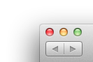
Yosemite introduces a white background behind toolbar items, regardless of whether they are buttons or actions. Especially the finder makes a huge mistake, though by not combining backwards and forwards (as it was in Mavericks):

Also that white background behind actions looks to narrow in apps like Keynote:


7. The zoom button is now fullscreen
Every version of Mac OS X version from 10.0 to 10.9 had the same behaviour on the three stoplights: close, minimize, zoom. Yosemite changes this and removes the fullscreen button introduced in 10.7 Lion and makes the green stoplight fullscreen instead. The old, better on bigger screens behaviour of zooming is now available when you press option and then click the green button. What a hassle. Workaround: Double clicking the titlebar at least zooms.
8. No sidebar in iTunes anymore
iTunes 11 already removed the sidebar - but only temporarily. It was still optionally available. iTunes 12 removes the sidebar entirely and makes me use the new awkward navigation behaviour instead. Why?
But…
At least not everything is bad but also not much is good (from a design perspective, not the features). What I really like are the new unified window chromes that use previously unused space in the titlebar of every window.

I am going to stay on Mavericks for now and hope that Apple gets its sanity back in OS X 10.11.